DataComb: An interface for combing through tabular datasets
June 21st, 2015
Tables are perhaps one of the most ubiquitous means of displaying information. In general and particularly with small datasets, the work well; they show exact values and are simple, logical and familiar. However, for larger datasets they become unwieldy - reading and processing a wall of text is difficult. In the spirit of not having a wall of text, this post is a few notes on building an interface and more robust table for analyzing and combing through data. skip to demo
Visualizing data
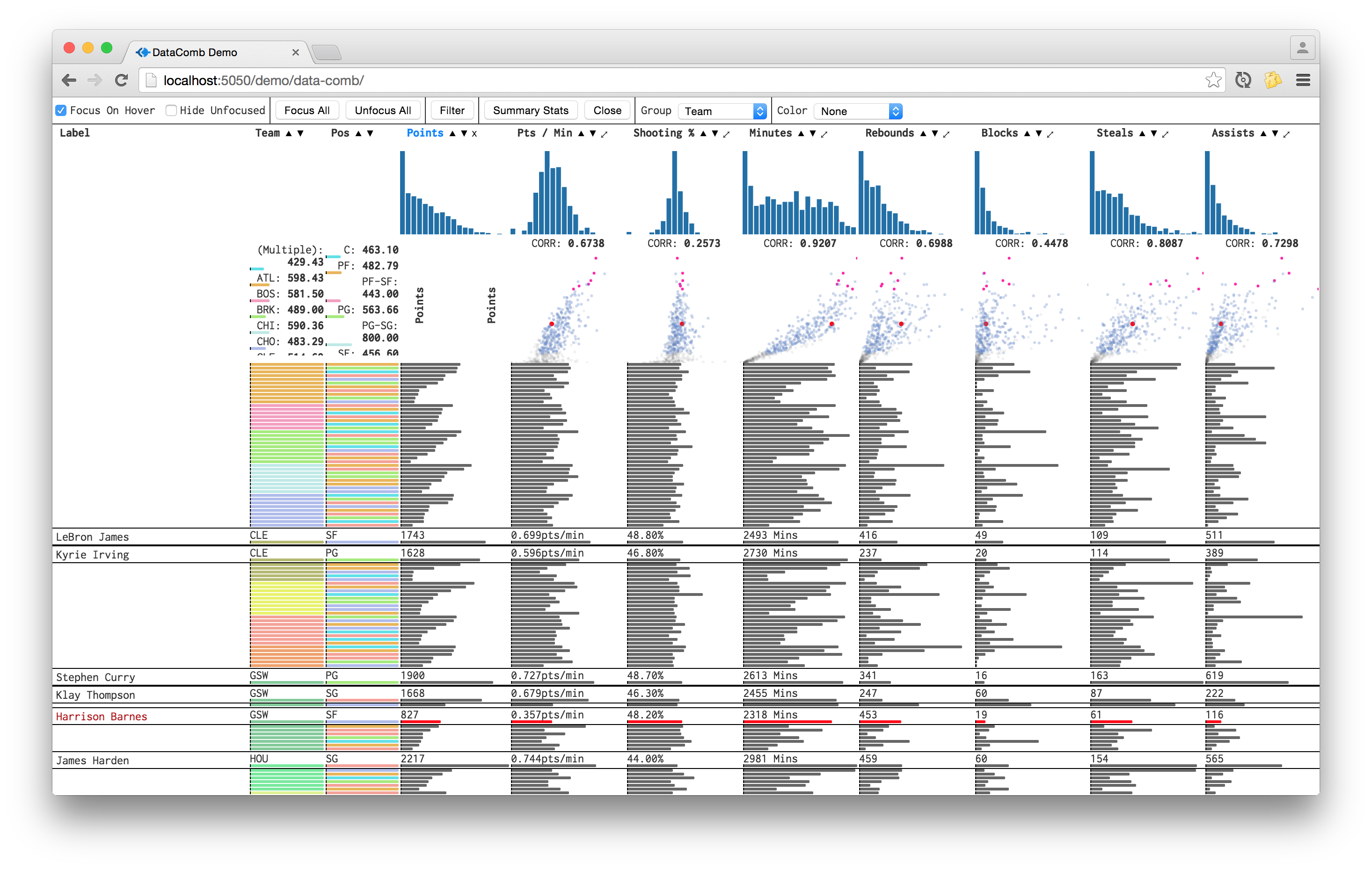
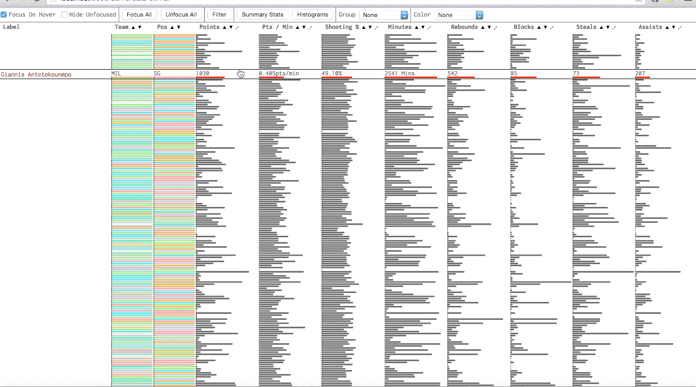
The most striking distance between this interface and a traditional table is that text is replaced with color bars and variable length bars for columns with discrete and continuous data, respectively. This primarily serves two purposes: rows become shorter/data density increases and the table becomes more accessible and takes less time to interpret.
Adding interactivity
To give more control and make it easier to answer questions with data, there are a handful of interactions to focus on particular rows where exact values and row label may be important. To expand rows, they can be hovered, clicked or dragged(to quickly expand multiple rows). The scatter plots and histograms also allow for hover and click functionality.
Everything aligns
One nicety of this tool and a feature that makes the interactions easier to use is that the bars in the table align with the elements above them. The table bars, scatter plots, histograms and filter sliders share a common axis.
Higher Order Functions
Many of the features of the DataComb are analogous to common higher-order functions; the interface acts somewhat like an application of these functions to a dataset.
- GroupBy: Rows can be grouped by discrete column values and sort/filter settings will be respected within each group. A possible enhancement would be to quantize and allow for grouping on continuous values.
- Filter: Rows can be filtered by toggling discrete values and a range slider for continuous values.
- Map: Column definitions can be defined by functions and derivative of multiple attributes on the dataset or other functionality.
- Sort: This is nothing new, but with bars and interaction it becomes more useful. After the table is sorted, you can click and drag to select the top n rows for a given column. It is also becomes easy to see relationships between columns.eg: when the table is sorted by col A, are there any patterns in col B? are there any outliers/bars sticking out?
Relationships between columns
To more explicitly show relationships between columns, they can be expanded to show a scatter plot of themselves on the y-axis and all other columns on their respective x-axes(align with bars).
Distribution information within a column
The bars already help in showing the nature of values within a column, however, for more detailed distribution information there are controls to show histograms and summary statistics of columns with continuous data.
Further Reading
This interface is the result of working on finance/visualization related freelance projects and needing a better way to sift through data. It is also heavily influenced by this awesome talk by Christophe Viau and a paper by Ramana Rao and Stuart K. Card.
Live Demo
This is very much a work in progress and works best(only?) on larger screens and Google Chrome. I chose this dataset because it is something I had previously tried to build a tool for and is somewhat topical - go Warriors!
Demo
Data collected from basketball-reference.com.