Finding S&P 500 Clusters and Diversification with a Dendrogram
October 25th, 2015
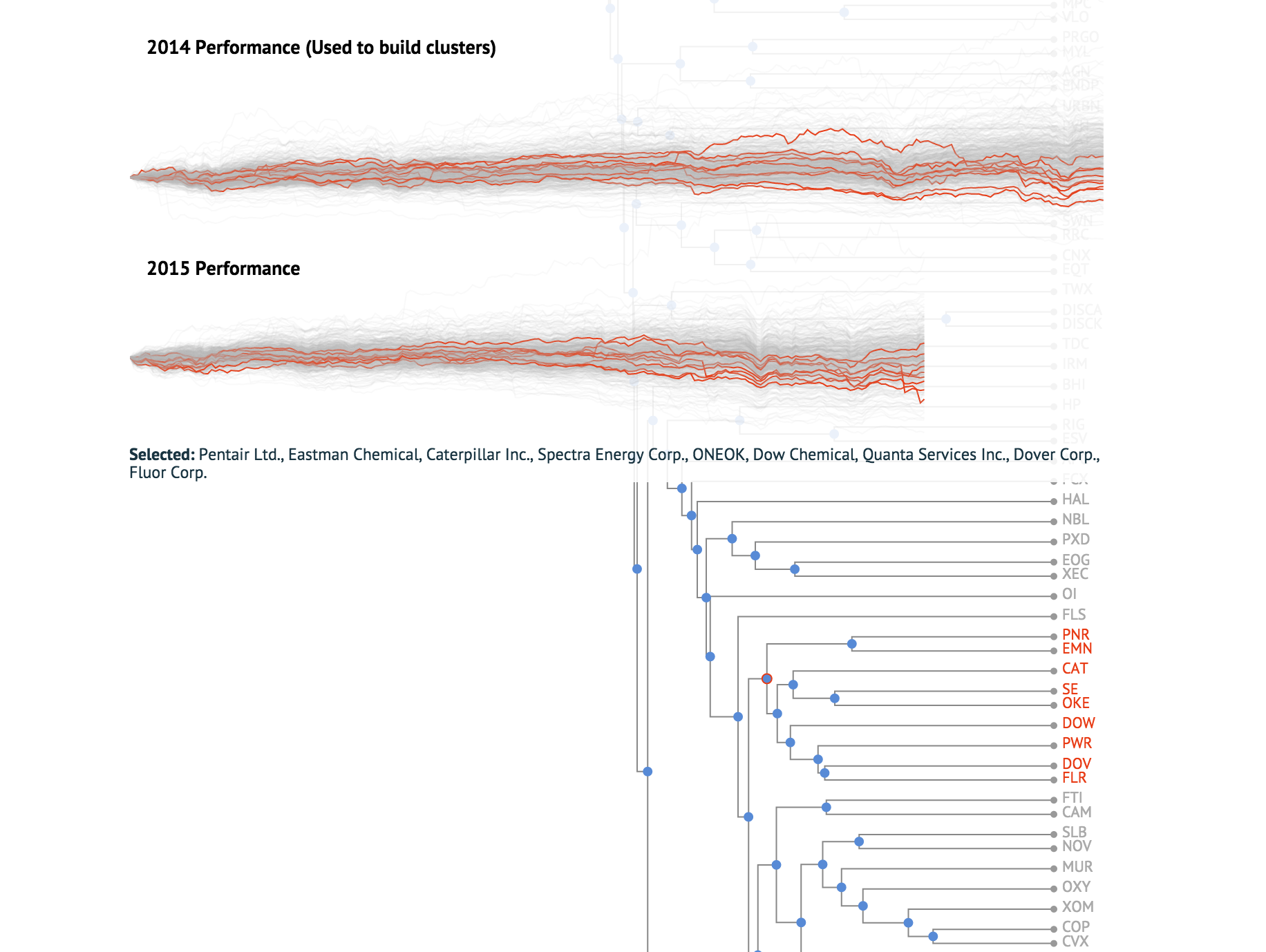
This is a follow up and more in-depth, less didactic example of last week's post. Instead of crayon colors, this is a dendrogram of SP500 components. Each symbol is represented as a vector of weekly adjusted log returns in 2014(found using the R quantmod package(getSymbols(..), weeklyReturn(..)) and the tree was built using hclust(..) and using Euclidean distance between the return vectors. As expected, the clusters match sectors and industries fairly well; financials and energy stocks form tight clusters. In addition to the data used to build the clusters(2014), a timeseries for 2015 is also shown to see if cluster components continue to move together. Because this is a heavy visualization, it may take a moment to load and render the data and will perform poorly on mobile devices.
*** This and all other content and opinions on bytemuse.com are not investment advice of any kind. This is intended to demonstrate programming and mathematical concepts; speak with a qualified professional if you are looking for advice.
Click a blue node to highlight the leafs(symbols) that compose the cluster. Nodes farther to the right indicate higher correlation and tighter clusters.