NBA Interactive Stat Comparison
March 14th, 2014
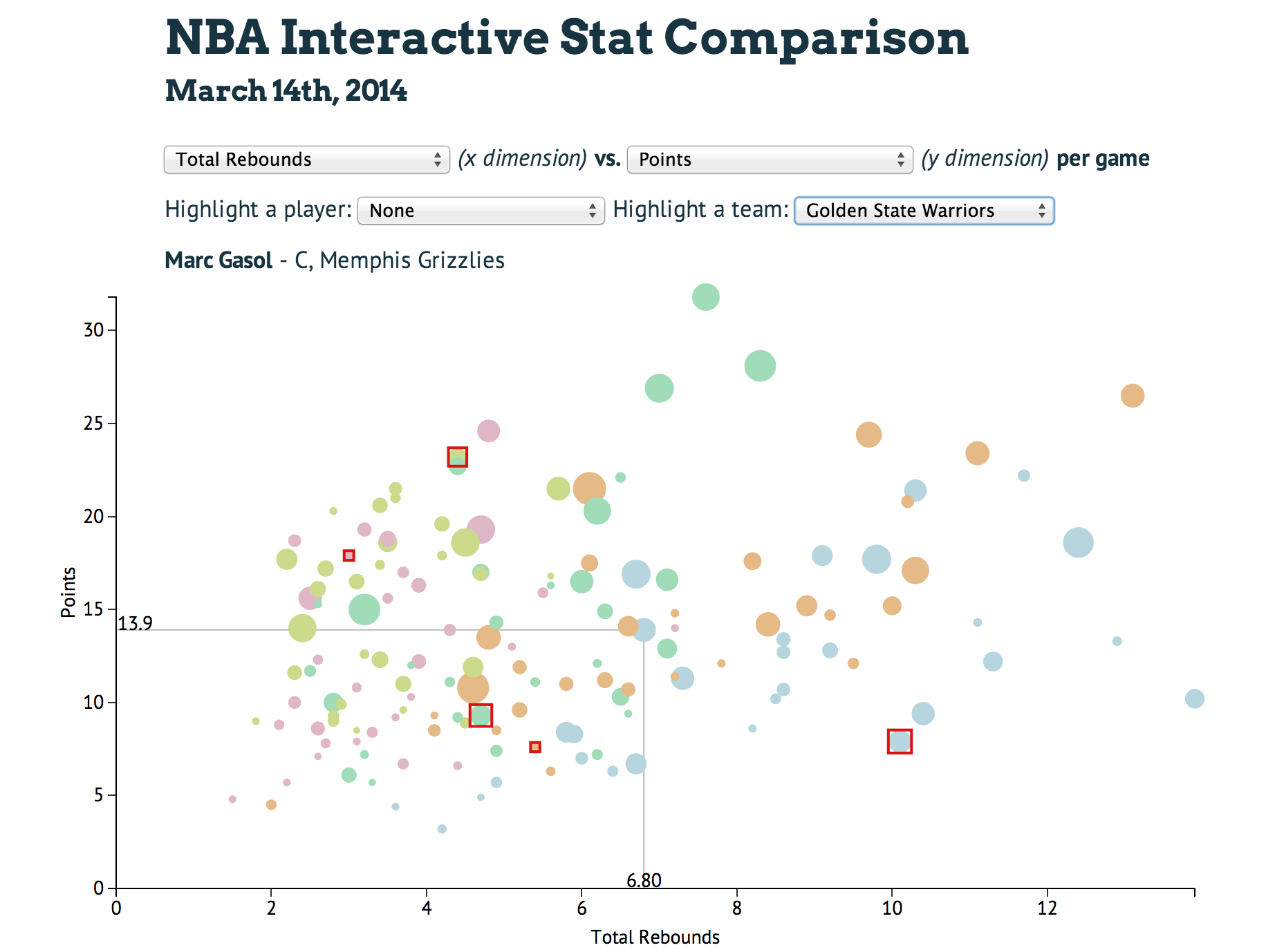
In the spirit of March Madness, I wanted to create a basketball related visualization. Initially, I was going to create a simple scatter plot of points/game vs rebounds/game since those are two of the most important stats in basketball and good indicators of offensive and defensive performance. I also thought it would be interesting to see how position and salary correspond to those stats, so I added the former in as the color and the later as the radius of each point.
(x dimension) vs. (y dimension) per game
Highlight a player: Highlight a team:
Hover over a point for more player information.